Color, Comfort, and Love at First Sight
- Blog Post
- Exhibitions


Open now at the Cleveland Museum of Art, Color and Comfort: Swedish Modern Design presents the modern styling of mid-twentieth-century Swedish design, featuring textiles, ceramics, and glass from the CMA’s collection. How does the CMA help visitors connect with and learn more about these vibrantly designed textiles? In the post below, Lori Wienke, CMA’s Associate Director of Interpretation, details the interpretation process for this show, and explains how visitors can dive deeper into this stunning exhibition.
I fell in love with these textiles the moment I saw them. I was in textiles storage with colleagues from the curatorial, interpretation, design, exhibitions, and conservation departments when Associate Conservator of Textiles Robin Hanson rolled out these bold, colorful, truly joyful textiles for us to review and discuss. As each one was revealed, the vibrancy, boldness, and life these textiles possess were striking — each one a masterpiece of fully realized design.
“As each one was revealed, the vibrancy, boldness, and life these textiles possess were striking — each one a masterpiece of fully realized design.” — Lori Wienke, Associate Director of Interpretation
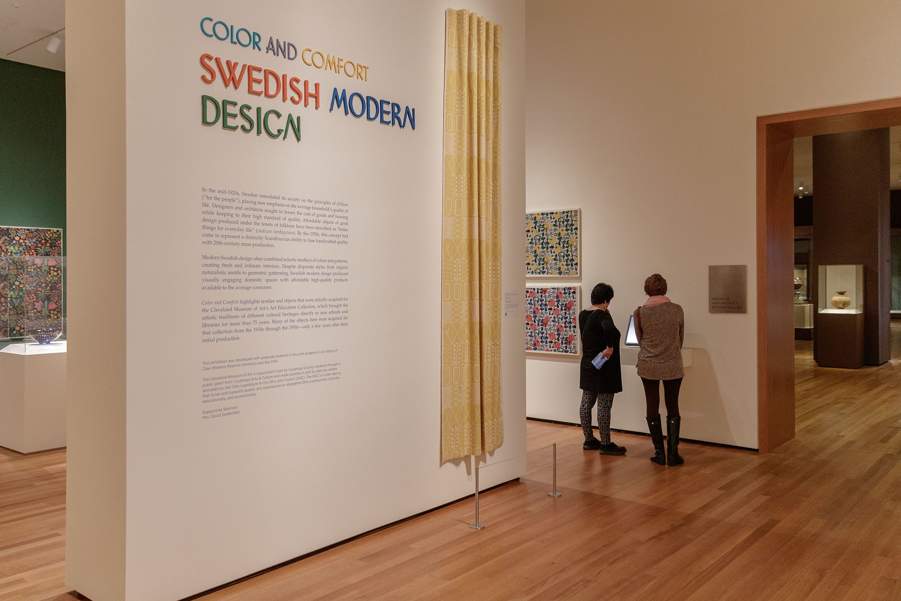

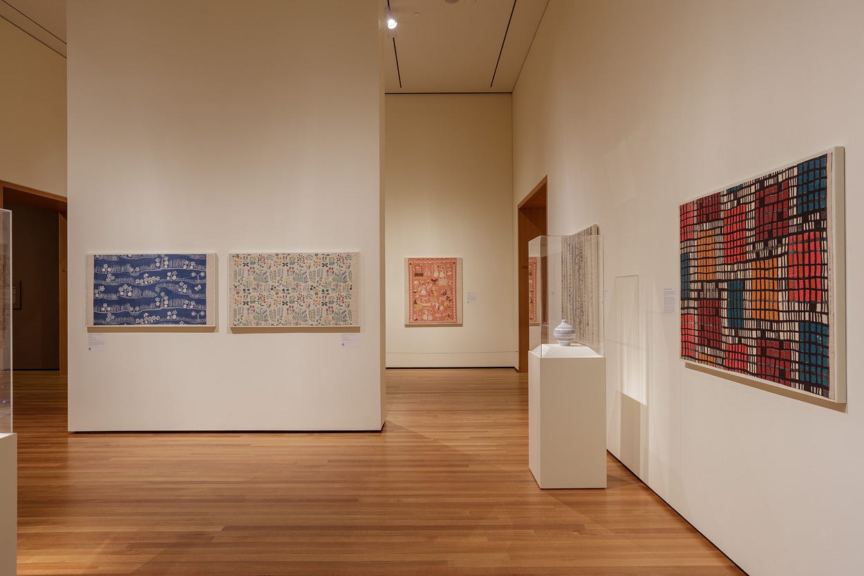
Color and Comfort: Swedish Modern Design showcases 19 of these textiles, which have never been shown as a group before. The textiles are organized in four thematic groupings: Nature as Pattern, Color and Contrast, Finding Geometry, and Nostalgia for Past Traditions. Also, there are a handful of ceramics and glass that provide additional context for visitors.
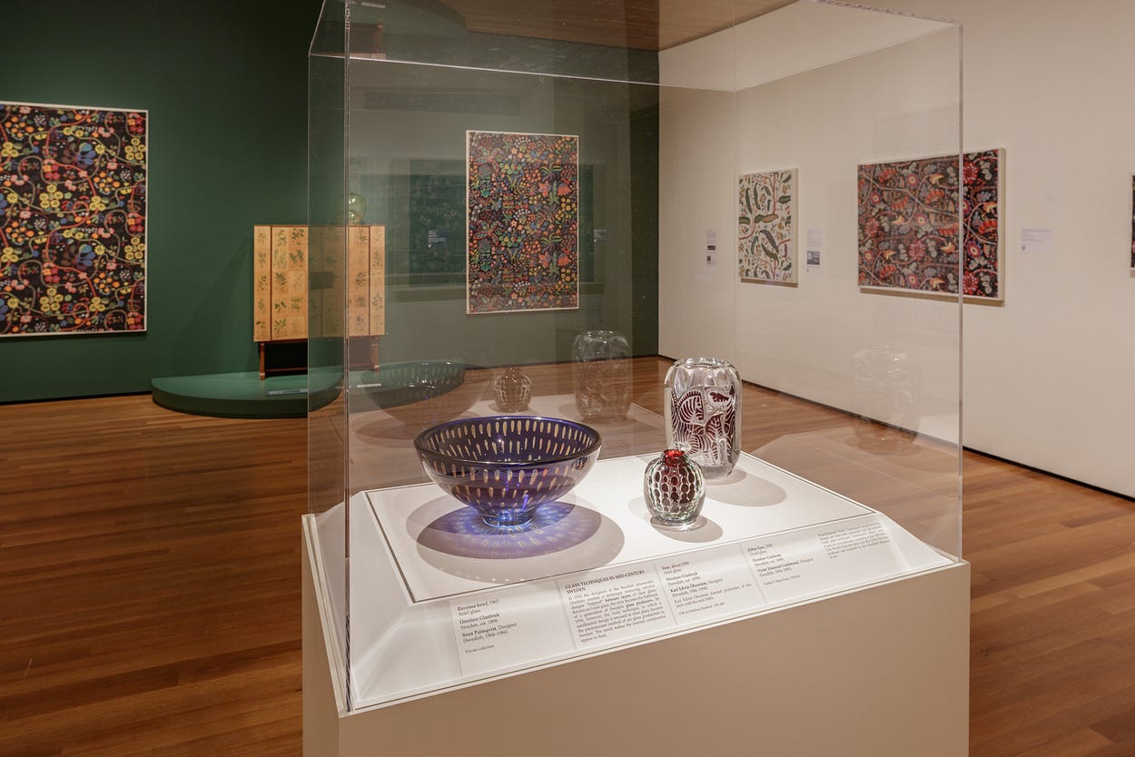
The overarching concepts of the show are the development of Swedish modern design, Scandinavian cultural heritage and the idea of comfort, and the relationship between interior design, art, and the home. In support of these ideas, we developed interpretive tools to provide visitors with additional context and the opportunity to visually decipher these extraordinary designs.


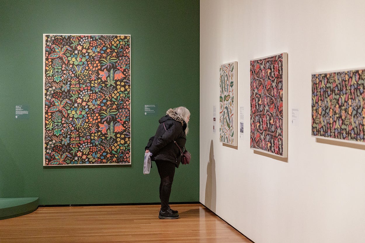
In developing an interpretive strategy for an exhibition, we seek to activate works of art for our visitors. We want to create opportunities for meaning-making regardless of what knowledge the visitor brings to the artworks. The artworks’ explanatory didactics, or wall labels, provide much of the context for the works on view.
But reading labels is not for everyone. We’ve also created videos that pair contextual images with audio from a conversational interview with Curator of Decorative Art and Design Stephen Harrison and Case Western Reserve University graduate student Kate Hublou. These media segments take their cue from the exhibition’s main concepts and provide additional background on the designers who created these textiles, ceramics, and glass.

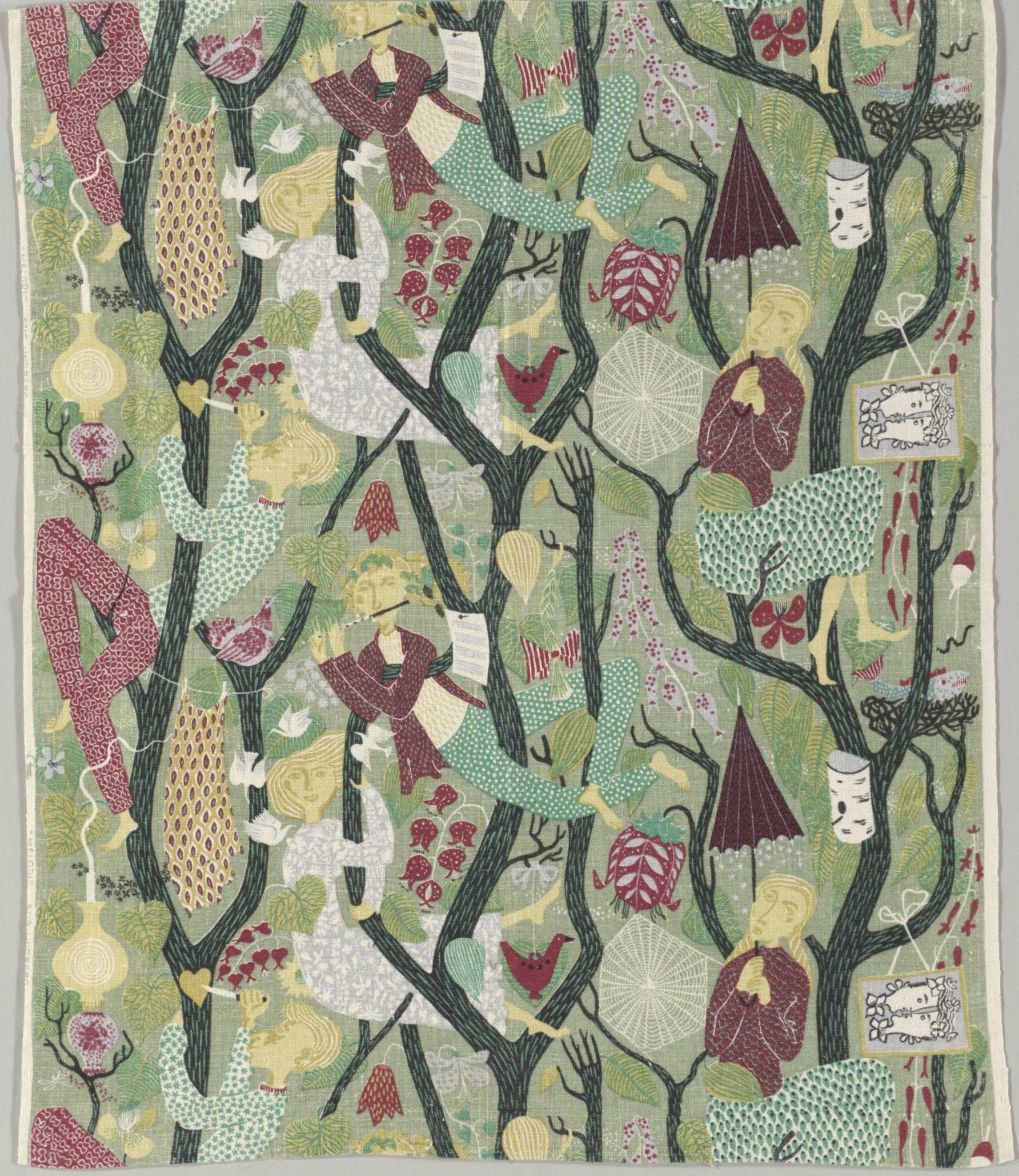
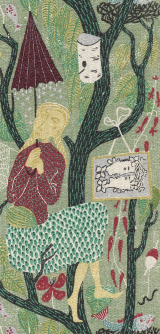
For visitors who want to explore the design of these textiles in a more visual way, we have enabled scanning of both 2D textiles and some 3D artworks in this gallery using the CMA’s ArtLens App. The app’s scan function enables close looking, specifically for artwork details, and offers visitors small bites of information about these parts of the whole. For example, my favorite textile is Melodi (Melody) by Stig Lindberg. This work features numerous details that call out for more explanation. If you scan this textile in the exhibition, you will be offered three tidbits that correspond to particular details. For me, the colorful forms and whimsical details recall childhood fairytales. Every time I look at it, I see something new!

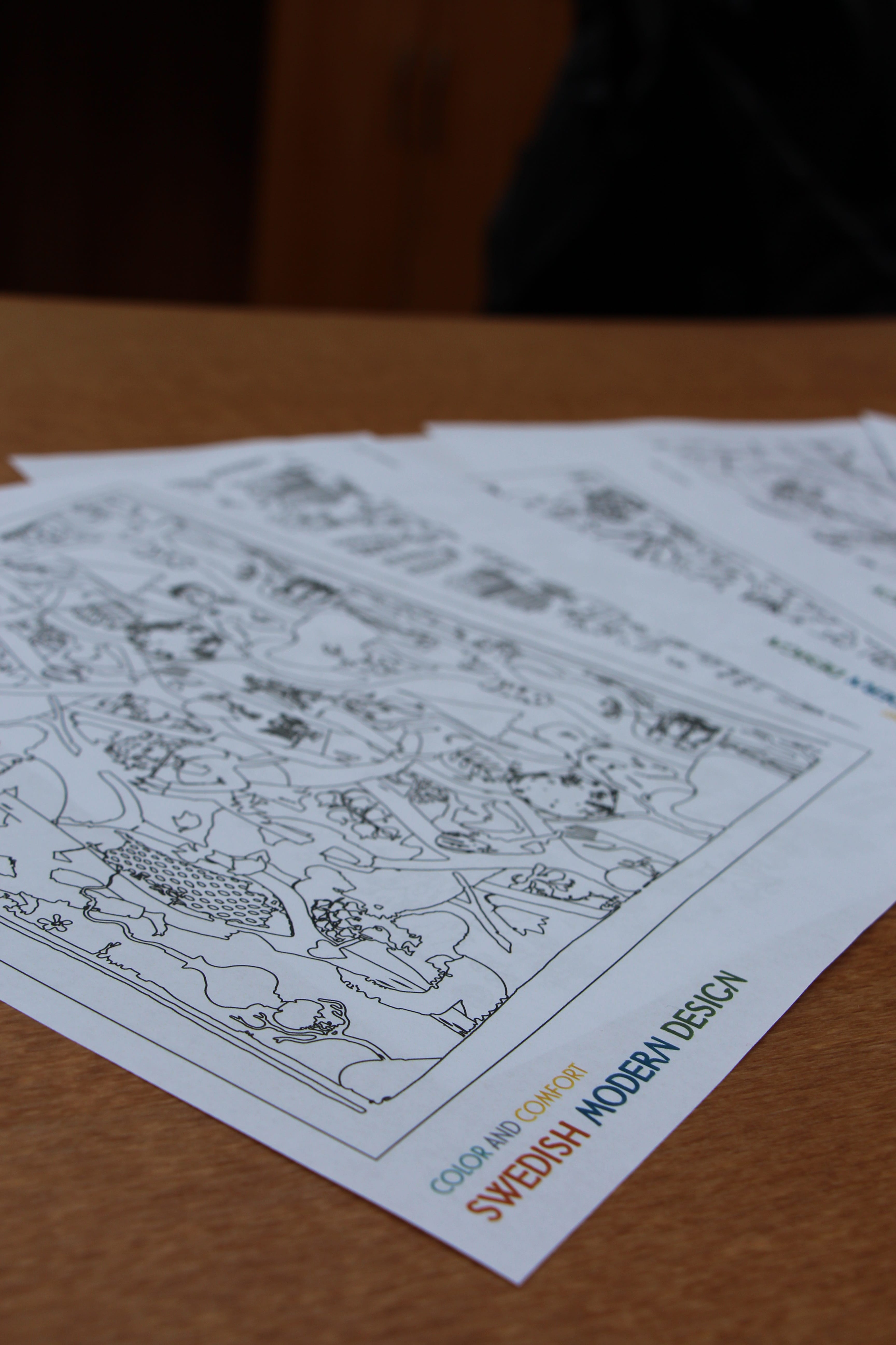
Finally, for those who want to explore textile designs in more detail and experiment with different colorways, we have a selection of textiles that have been made into coloring book pages that visitors can take away and color at home. We created similar coloring pages for the last installation in this space, William Morris: Designing an Earthly Paradise, and they were wildly popular.

In selecting and designing these tools, we hope to provide an entry point into this material that resonates with every visitor. I’m certain the color, pattern, and design of these textiles will both surprise and delight everyone who visits this gallery. It’s the perfect exhibition to bring to mind the color and exuberance of spring — hopefully just around the corner.


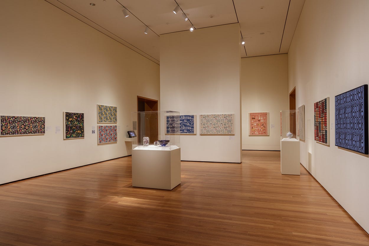
The concept for this exhibition was developed with graduate students in the joint program in art history of Case Western Reserve University and the CMA.